I found that many tutorials on Bootstrap are incomplete,and the
transformation is not well,thus I visited w3school and to make sure the
accuracy of this text,I decided to write it in English.
1 Introduction
1.1 What is Bootstrap?
Bootstrap is a free front-end framework for faster and easier web
development
Bootstrap includes HTML and CSS based design templates for
typography, forms, buttons, tables, navigation, modals, image carousels
and many other, as well as optional JavaScript plugins
Bootstrap also gives you the ability to easily create responsive
designs
What is Responsive Web Design? Responsive web design is about
creating web sites which automatically adjust themselves to look good on
all devices, from small phones to large desktops.
1.2 First Web
1.2.1 Add tthe HTML5 doctype
Bootstrap 5 uses HTML elements and CSS properties that require the
HTML5 doctype.
Always include the HTML5 doctype at the beginning of the page, along
with the lang attribute and the correct title and character set:
function: * width=device-width:sets the width of the
page to follow the screen-width of the device (which will vary depending
on the device). * initial-scale=1: sets the initial zoom
level when the page is first loaded by the browser.
2 Containers
There are two main containers: * .container class:
provides a responsive fixed with container *
.container-fluid class:proveides a full width
container,spanning the entire width of the viewport
2.1 Fixed container
Use the .container class to create a
responsive,fixed-width container.
1
2
3
4
<divclass="container"> <h1>My First Bootstrap Page</h1> <p>This is some text.</p> </div>
2.2 Fluid container
Use the .container-fluid class to create a full width
container,that will always span the entire width of the screen(width is
always 100%)
1
2
3
4
<divclass="container-fluid"> <h1>My First Bootstrap Page</h1> <p>This is some text.</p> </div>
2.3 Container padding
By default, containers have left and right padding, with no top or
bottom padding. Therefore, we often use spacing utilities, such as extra
padding and margins to make them look even better. For example,
.pt-5 means "add a large top padding":
1
<divclass="container pt5"></div>
2.4 Container border and color
2.5 Responsive containers
You can also use the .container-sm|md|lg|xl classes to
determine when the container should be responsive.
<divclass="container"> <divclass="row"> <divclass="col-sm-4">//col-sm-4 specifies that on a small screen, this column will take up a quarter of the width of one of the 12 columns. On a large screen, it will remain the same width if no other class name is specified to override the style. <divclass="bg-primary text-white p-3">Column 1</div>//bg-primary:It is usually the most prominent colour in the page theme and is used to highlight important elements. In Bootstrap, the default primary colour is blue (#007bff). </div> <divclass="col-sm-4"> <divclass="bg-secondary text-white p-3">Column 2</div>//bg-secondary:Usually used to complement the primary colour and provide an extra element of colour to the page. The default secondary colour is grey (#6c757d). </div> <divclass="col-sm-4"> <divclass="bg-success text-white p-3">Column 3</div>//bg-success:The colour used when indicating a successful or positive action. The default success colour is green (#28a745). </div> </div> </div>
<!-- Link Bootstrap JS (Optional) --> <scriptsrc="https://stackpath.bootstrapcdn.com/bootstrap/4.5.2/js/bootstrap.min.js"></script> </body> </html>
4 Text/Typography
4.1 <h1> to
<h6>
Bootstrap 5 styles HTML headings (<h1> to
<h6>) with a bolder font-weight and a responsive
font-size.
You can also use .h1 to .h6 classes on other elements to make
them behave as headings if you want:
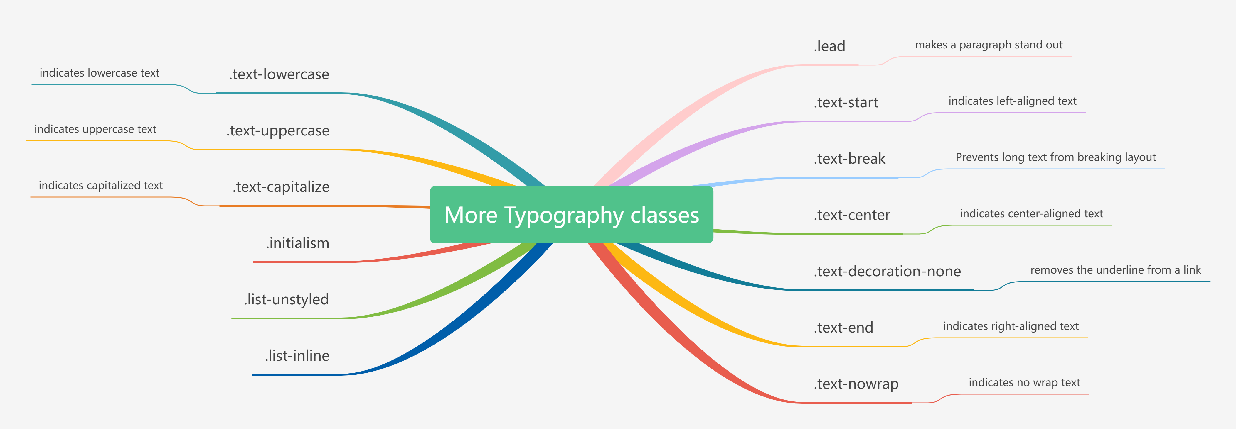
Display headings are used to stand out more than normal headings
(larger font-size and lighter font-weight), and there are six classes to
choose from: .display-1 to .display-6
4.3
In Bootstrap 5 the HTML <small> element (and the
.small class) is used to create a smaller, secondary text
in any heading:
4.4
Bootstrap 5 will style <mark> and
.mark with a yellow background color and some padding
4.5
Bootstrap 5 will style the HTML <abbr> element
with a dotted border bottom and a cursor with question mark on hover
### 4.6
Add the .blockquote class to a
<blockquote> when quoting blocks of content from
another source. And when naming a source, like "from WWF's website", use
the .blockquote-footer class
<divclass="container mt-3"> <h1>Blockquotes</h1> <p>The blockquote element is used to present content from another source:</p> <blockquoteclass="blockquote"> <p>For 50 years, WWF has been protecting the future of nature. The world's leading conservation organization, WWF works in 100 countries and is supported by 1.2 million members in the United States and close to 5 million globally.</p> <footerclass="blockquote-footer">From WWF's website</footer> </blockquote> </div>
</body> </html>
### 4.6
<dl>:describtion list
4.7
Inline snippets of code should be embedded in the code element
1
p>The following HTML elements: <code>span</code>, <code>section</code>, and <code>div</code> defines a section in a document.</p>
4.8
To indicate input that is typically entered via the keyboard, use the
kbd element
### 4.9
Text in a pre elementis displayed in a fixed-width font,and it
preserves both spaces and line breaks.
<div class="container mt-3"> <h2>Typography</h2> <p>The <abbr title="World Health Organization">WHO</abbr> was founded in 1948. (normal abbr)</p> <p>The <abbr title="World Health Organization"class="initialism">WHO</abbr> was founded in 1948. (slightly smaller abbr)</p> </div>
</body> </html>
list-unstyled
Removes the default list-style and left margin on list items (works
on both <ul> and <ol>). This class
only applies to immediate children list items (to remove the default
list-style from any nested lists, apply this class to any nested lists
as well)
list-inline
Places all list items on a single line(used together with
.list-inline-item on each <li>
elements)
Bootstrap provides three types of form layouts: * Vertival form(this
is default) * Horizontal form * Inline form
Standard rules for all three form layouts: * Wrap labels and form
controls in <div class="form-group"> * Add class
.form-control to all textual
<input>,<textarea>,and
<select> elements
<body> <divclass="container"> <h2>Inline form</h2> <p>Make the viewport larger than 768px wide to see that all of the form elements are inline, left aligned, and the labels are alongside.</p> <formclass="form-inline"action="/action_page.php"> <divclass="form-group"> <labelfor="email">Email:</label> <inputtype="email"class="form-control"id="email"placeholder="Enter email"name="email"> </div> <divclass="checkbox"> <label><inputtype="checkbox"name="remember">Remember me</label> <buttontype="submit"class="btn btn-default">Submit</button> </form> </div> </body> </html>
inline form
6.4 Horizontal Form
A horizontal form means that the labels are aligned next to the input
field (horizontal) on large and medium screens. On small screens (767px
and below), it will transform to a vertical form (labels are placed on
top of each input).
Additional rules for a horizontal form: * Add class
.form-horizontal to the <form> element *
Add class .control-label to all <label>
elements